There has been a string of rebrand projects over the last few years regarding Scottish whiskey, Glenfiddich, Laphroig and Chivas. Whilst we love the Glenfiddich rebrand, the boldest of these rebrands has to be Glenlivet, which we have chosen to focus on.

With the growing demand for whiskey abroad, companies are having to appeal to consumers who may not appreciate the history and heritage of whiskey in Scotland. With some whiskey companies targeting younger consumers (David Beckham advertising Haig Club), you can understand why these long standing distilleries might want to review and update their brands.
The distilleries already mentioned have updated their brand by making slight adjustments to their existing image – whether simplifying the logo or changing the typeface.
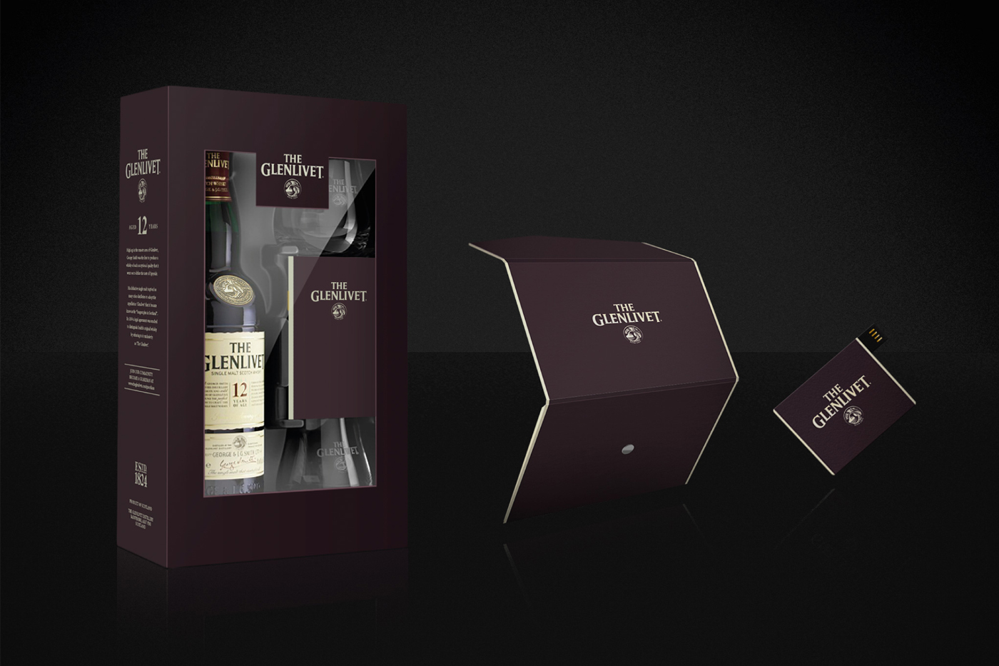
Glenlivet have taken the bold move of introducing a completely new logo and a new colour to it’s packaging. They have retained the name in it’s original typeface – which means it is not completely unrecognisable to it’s loyal consumers.
London based design practice ‘SomeOne’ worked with illustrator and craftsman Christopher Wormell to create the new bridge and flowing river logo. This replaced the Scottish thistle marque that had been used for more than fifty years.
‘Glenlivet’ literally means ‘The valley of the smooth-flowing one’ and refers to the River Livet, which flows through the distillery estate and whose water is the source for the whiskey.
The River Livet passes under an old smuggler’s packhorse bridge. The bridge was allegedly used to smuggle whiskey from the estate in the 19th century by early bootleggers. ‘It is this bridge that was identified for the new signifier, spiraling out from the centre of a perfect circle’, says Tom Myers, senior designer on the project.
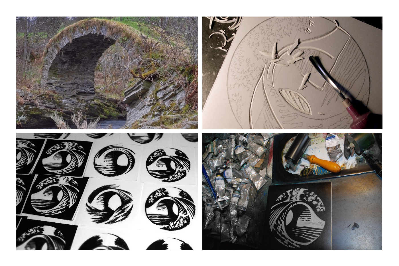
Interestingly, the new logo was not designed on a computer. The design was created by Christopher Wormell using sketches and then a technique called Linocut. Linocut is a printmaking technique, a variant of woodcut in which a sheet of linoleum (sometimes mounted on a wooden block) is used for the relief surface. ‘I’ve been making linocuts for many many years – for most of my life,’ Christopher says. ‘Drawing with a lino cutting tool feels natural to me; making white lines on a black background and thinking in terms of solid blacks and bright whites…these are things that make it the perfect medium for simple, iconic, imagery,’ he says.
When comparing the new logo with the old version, it seems strange to think that the thistle (used for over 50 years) only relates to the fact that the whiskey is ‘Scottish’!
The river and bridge logo is so steeped in history of the whiskey that it’s hard to believe it is only now featuring in their branding.
More companies, especially long established ones, should take the time to look at their branding and try and make it mean something instead of just going for the obvious choice.
The new Glenlivet branding is unique to them, full of history and has created using craftsmanship – possible quite rare in this day and age.
I remember when computers weren’t so readily available in the design industry (and that is less than 20 years ago) and when a lot design work was done by hand with some amazing results, So we can appreciate the effort and consideration of the new Glenlivet branding.
It is a bold move to change the look completely especially with such an established product as Glenlivet but we think it’s a gamble that has paid off and will bring them many more consumers from across the globe for many years to come!
